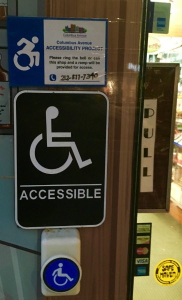
Symbol Of Accessibility
By the late 1960s, as the disability movement grew, the need for symbol to designate accessible facilities was being discussed in a number of countries. Different access symbols had already popped up in France, Australia, Canada, the United Kingdom and the United States. As former RI Global Secretary-General Norman Acton recalled, “several of us could see a messy situation develop with multiple symbols – so there was some urgency.”
Acton asked Karl Montan, first Director of the Swedish Handicap Institute and Chair of the RI International Commission for Technical Aids (ICTA) if the commission could come up with a practical symbol that was readily identifiable from a reasonable distance, self-descriptive, simply yet esthetically designed with no secondary meaning. Ms. Susanne Koefoed, a Danish graphic design student, submitted the winning design, a simple motif of a stick figure using a wheelchair to indicate barrier-free access. After some modifications, including ‘humanizing’ it by adding a circle to the top of the seated figure for a “head”, the World Congress formally Adopted the International Symbol of Access in 1969.

Sharing the Symbol
The International Symbol of Accessibility quickly gained wide acceptance, with the help of the 3M Corporation and Seton Identification Products, which manufactured mass quantities of signs to distribute around the world- within the decade it became a universally used designation. The single largest boost to universal adoption of the symbol took place in 1974 when the imprimatur of the United Nations gave the Symbol universal stature comparable to the endorsement granted several years earlier by the International Organization for Standards (ISO) in Geneva. RI Global decided against patenting or trademarking the Symbol for the greater good, instead, it only mandated its specifications. Within a decade, the Symbol of Access became embedded in the urban fabric of cities and towns across the world.
The Symbol of Access, which was designed by RI in 1969 and is being applied universally, has contributed to the momentum of disability-inclusive development.


The New Symbol?
As the politics of disability have become more nuanced, a growing audience has lobbied for an updated version of the International Symbol. The leader in the discussions, the Accessible Icon Project, has created a new logo with a forward-leaning head and motioning arms indicating the figure as the “driver” or decision maker about his or her mobility. New York adopted the new symbol in 2014 and Connecticut has considered the changes, as have several Western states. The debate regarding the merits of the new vs. old symbol has also started to enter the fold of various activist organizations, including RI Global. The International Organization for Standardization has argued against the new design, citing universal recognition of the original one. Some disability rights activists also believe the new symbol implies prejudice toward people with more serious disabilities.
Proponents of the new symbol maintain they want the symbol to represent a new acceptance toward PwDs- one that does not underestimate them any longer. They believe the redesigned icon could prompt more funding and better social programs for PwDs. It has been suggested that a disability activist organization take the lead in bringing all parties to the table.
